

You are using an out of date browser. It may not display this or other websites correctly.
You should upgrade or use an alternative browser.
You should upgrade or use an alternative browser.
Another bit of flash
- Starter Me16363
- Start date

Fast track your progress with the world's premier training program the Artist Accelerator


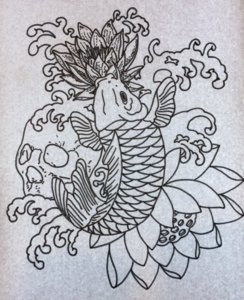


Hard for me to comment on the motif itself, this kind don't say me much, but I LOVE that you have the scales in order! 


Not sure if you nwed the flower on top, think just waves would give the koi head some breathing space... if that makes sense
- Starter
- #6
Agree about the waves, back to the drawing boardsScales do look pretty straight. I think the waves could use some re-design.


love the feel of this design, looks like you are confident with the style and its elements. few things though. the tail seems too flat and wide at the base where it curls to connect to the body. the top flower: it's centre coincides with the fish mouth, with the petals facing out, so it looks to me like the flower is coming out of fish mouth. needs some visual separation/ be repositioned slightly. also this flower is the only one that has fill/ texture, wonder if that is deliberate and why.
- Starter
- #8
I see what you are saying, it’s laid out as a stencil idea really that’s why there is not a great deal of detail in there. It definitely needs work especially on the waves and a few other bits. I like to put stuff on here and the comments help you see things from another perspective ??love the feel of this design, looks like you are confident with the style and its elements. few things though. the tail seems too flat and wide at the base where it curls to connect to the body. the top flower: it's centre coincides with the fish mouth, with the petals facing out, so it looks to me like the flower is coming out of fish mouth. needs some visual separation/ be repositioned slightly. also this flower is the only one that has fill/ texture, wonder if that is deliberate and why.

- Starter
- #10
The scales are done by hand on this one, I did a feint pencil line, mounted the sheet on my light board and followed the guidelines with a fine line marker. ??What method have you used to draw the scales? They're pretty perfect!!


Fast track your progress - The complete online tattooing course for beginners